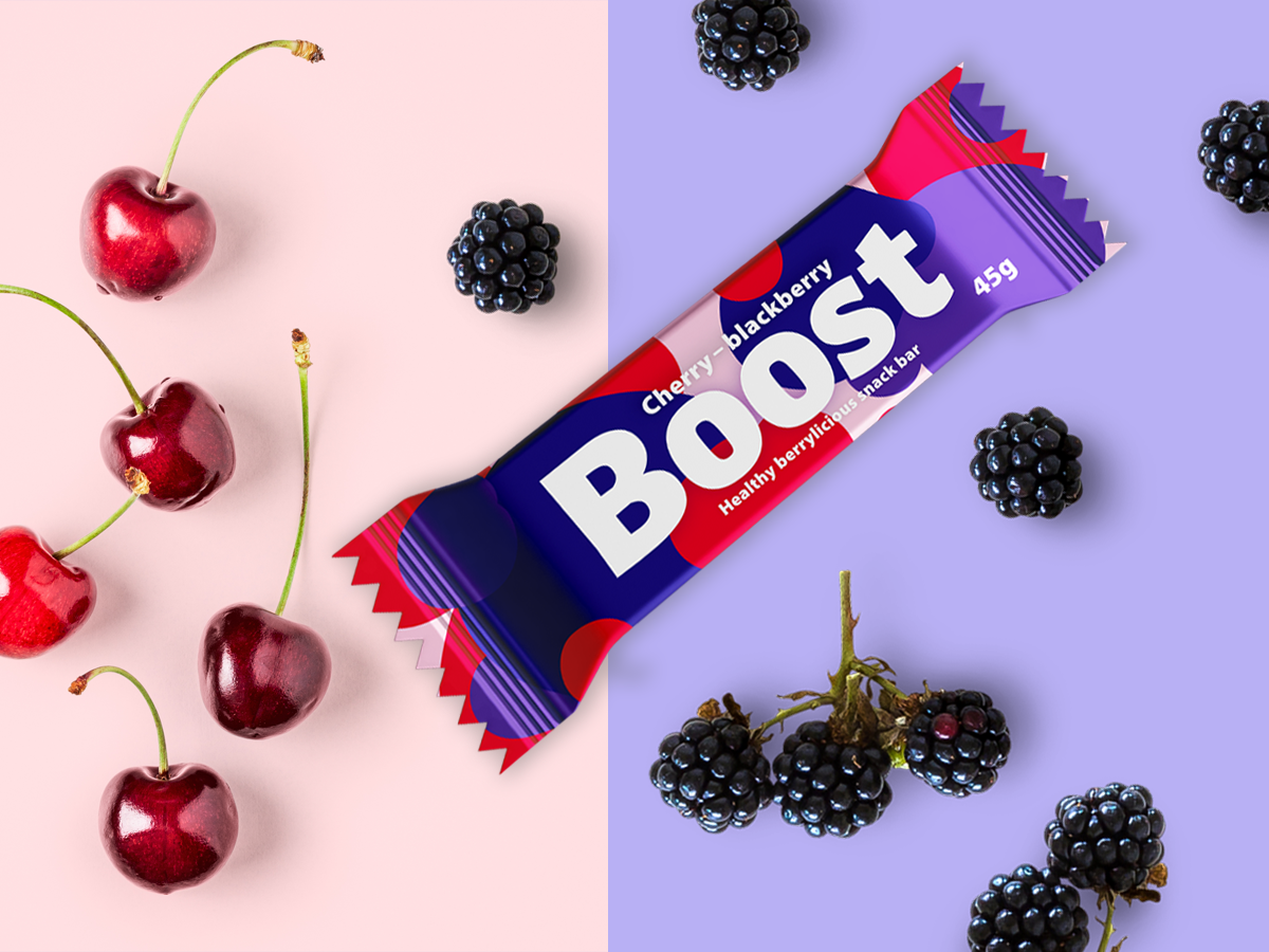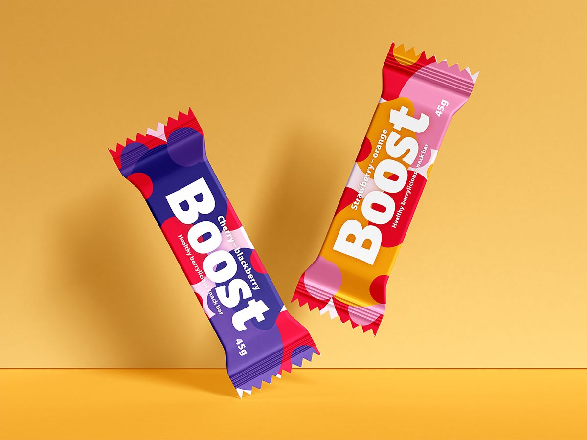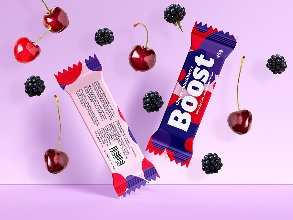
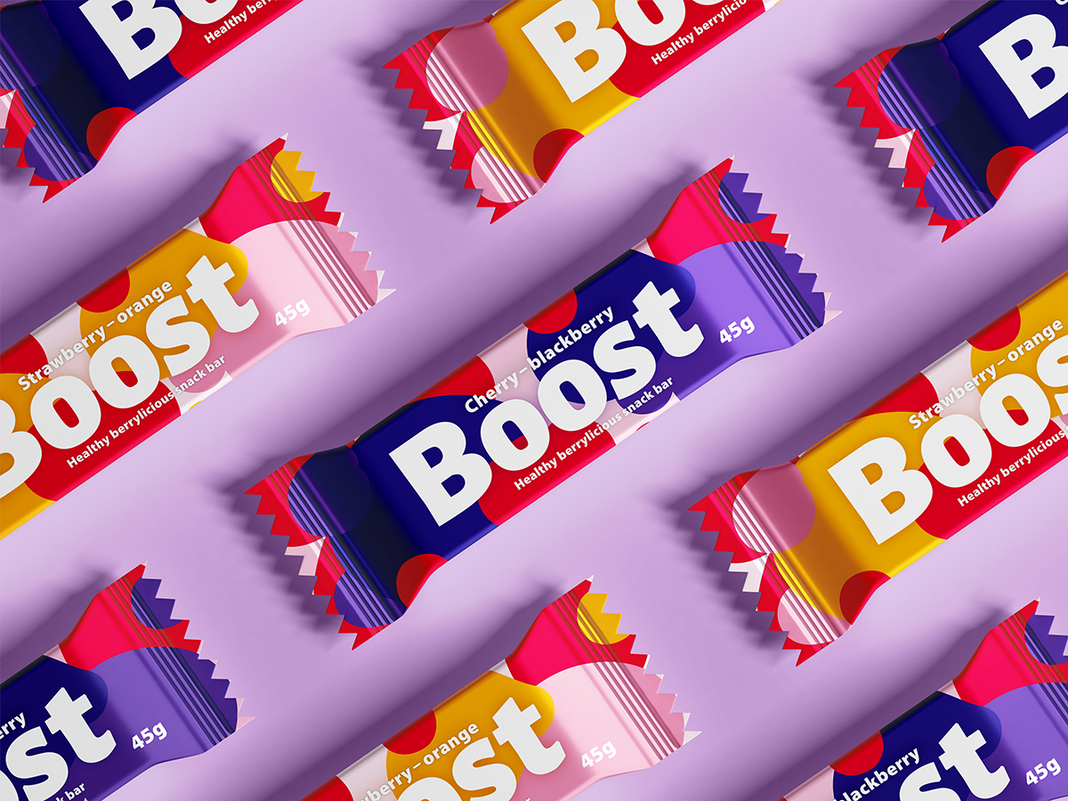
I envisioned a contemporary and invigorating appearance for this product to captivate consumers. The use of lively typography and vibrant color schemes is pivotal in crafting a distinctive identity of this snack bar. To convey a commitment to a healthy lifestyle and evoke a sense of freshness, I opted for dynamic, current colors reminiscent of berries.
The logo's typeface was carefully selected to embody playfulness, featuring captivating letter shapes that seamlessly align with the energetic vibe of an energy/snack bar. My aim was to introduce a novel concept that stands apart from existing products in the market.